
Chubb Life
Redesigning the Policyholder Experience
OVERVIEW
Chubb Life is a digital platform for managing life, health, and investment insurance policies. This project focused on helping users quickly understand their status and take action with confidence.
Research revealed that although core functions were available, the experience was fragmented and structured around internal system logic. As a result, users struggled to grasp their overall situation or determine next steps.
We addressed this by restructuring navigation around user intent, prioritizing status-driven information, and redesigning key service flows such as loan repayment.
Role
UX Researcher and Designer
Research lead, wireframing & interaction design; worked under design oversight
Duration
Oct. 2025 - Jan.2026
BACKGROUND
About Chubb Life
Chubb Life is a global insurance group operating across multiple markets with a strong focus on life, health, and investment-linked insurance products. In Taiwan, Chubb Life serves a broad customer base with long-term policies that span decades, resulting in complex account structures and high expectations for reliability, clarity, and trust.
Project Context
As insurance services become increasingly digital and self-served, policyholders rely more on platforms to understand their status and make decisions independently. While existing systems support basic tasks, they often emphasize functional completion over clarity and confidence.
This project was initiated as a Proof of Concept (POC) research study to provide user-centered insights and strategic directions for future platform consolidation and experience redesign.
METHOD
Research
This POC study employed a qualitative research approach to examine how users understand their insurance status and navigate self-service across multiple platforms.
The research consisted of three parts:
A pre-study survey used to segment participants by policy types, usage frequency, and engagement patterns
30 one-on-one interviews, each lasting approximately 60 minutes, combining interface walkthroughs with recent real-life scenarios
A competitive analysis of insurance platforms to identify common structural approaches and experience gaps

Analytical Framework
To frame the problems more systematically, we structured our analysis around how users move through the platform—from orientation to understanding, and finally to action.

Navigation

Policy Understanding

Service Execution
PROBLEM DEFINE
Synthesizing insights from user interviews, we identified three structural experience problems:
Fragmented Information Architecture
Users can find the information they need, but it is scattered across multiple pages and organized by system functions rather than by how users understand a single policy.
To understand the overall status of one policy, users must switch between pages and mentally piece information together on their own.
Unclear Information Hierarchy
The platform presents a large amount of data and numbers, but key decision-related information is not clearly prioritized. Without clear highlights, context, or signals of change, users struggle to quickly assess whether their current status is normal or whether action is required.
Low Self-Service Maturity
Although the platform covers multiple service flows, many critical steps still require paper forms, email communication, or direct contact with human agents to complete.
From the user’s perspective, self-service often only works part of the way, and they must eventually rely on manual support to finish the process or confirm outcomes. Compared to other insurance platforms, the overall convenience and completion level are relatively low, which weakens users’ confidence in digital self-service.
DESIGN STRATEGY
Based on the research findings, we translated the key problems into three design principles.
We used these three principles to guide our design decisions. The following sections show how they were applied in the actual interface.
NAVIGATION
For users, entering the platform is not about finding features—it is about understanding their current situation.
At the point of entry, users expect to quickly answer three questions:
What is my current status?
Is there anything that needs my attention?
What should I do next?
This initial orientation strongly shapes how confident users feel navigating the rest of the experience.
What we found?
Platform structure does not match user expectations
The platform is structured around internal system functions rather than how users expect to understand their insurance status. As a result, users are required to navigate through multiple entry points before they can form a basic sense of where they are and what matters.

Card-level information does not support quick understanding
On the homepage, each policy card only exposes three basic pieces of information:
Policy name
Policyholder / Insured
Policy effective date
These attributes are not sufficient for identification, they do not provide the contextual signals needed for quick judgment.

How competitors approach navigation?
Competitor platforms commonly treat the homepage as an orientation layer rather than a directory of features. Account-level status, pending actions, and recent changes are surfaced upfront, allowing users to quickly understand their situation before navigating deeper.
Instead of relying on users to explore in order to find meaning, these platforms prioritize high-signal information that helps users decide where to go next.


Design Response
① Surface What Matters First (Status-driven)
Time-sensitive alerts and changing signals are prioritized to help users quickly identify urgency and required actions.
② Make the Overall Status Immediately Clear (Holistic)
A consolidated asset overview shows users where they stand across all policies without mental aggregation.
③ Dynamic Signals Over Static Information (Action-oriented)
Dynamic information is emphasized over static policy terms to support quick judgment and next steps.
④ Simplified Coverage Structure (Holistic)
Coverage is summarized by meaningful categories instead of complex product names to improve comprehension.

⑤ Structure Policies the Way Users Think (Structured First)
Policies are first grouped by policy type, matching users’ mental models before exposing details.
⑥ Key Decision Information Visible Before Expansion (Scannable by Default)
Key decision indicators are visible at the list level, allowing comparison and prioritization without extra clicks.

POLICY UNDERSTANDING
Once inside the platform, users are not trying to read policy documents—they are trying to make sense of what they have.
At this stage, users want to quickly understand:
What does this policy actually cover?
How is it currently performing or changing?
Does this require any action from me?
If information is fragmented or overly detailed, users are forced to interpret and compare on their own, increasing cognitive load and decision uncertainty.
What we found?
Dynamic signals are buried under static information
For Investment Policies, key dynamic indicators—such as policy value, performance trends, dividends, and premium status—are not treated as first-class information.
Instead, they are scattered across secondary views or hidden behind additional interactions.
This makes it difficult for users to quickly assess “what has changed” versus “what is fixed.”

Coverage understanding is clause-based, not coverage-based
For Health Insurance, coverage information is presented primarily as line-by-line clauses and numerical tables, without meaningful grouping or hierarchy.
Users cannot easily answer:
What risks am I currently covered for
Where are my coverage gaps?
What limits or conditions matter most?
This leads to high interpretation cost and low confidence in understanding one’s protection status.

How competitors approach it?
Policy pages as status interpretation interfaces
Leading competitors treat policy content pages as policy-specific dashboards, not document repositories.
Upon entering a policy, users immediately see:
Current policy value or coverage status
Performance or claim-related highlights
Upcoming or required actions
Dynamic information is positioned as the primary entry point for comprehension.


Coverage presented by protection logic
For A&H policies, competitors organize content around coverage categories (e.g., hospitalization, surgery, outpatient) rather than policy clauses.
This allows users to quickly grasp:
What they are protected against
How much coverage they have
Where protection may be insufficient


Design Response
① From “policy information pages” to an investment decision interface
For investment-linked policies, we redesigned the page around an Investment Summary. Key dynamic signals—account value, performance trends, dividends, and available cash—are surfaced first to help users quickly understand how their investment is doing right now, before taking any action.

② Make the Overall Status Immediately Clear (Holistic)
Policies are first grouped by policy type, matching users’ mental models before exposing details.

Service Execution
What we found?
Fragmented loan flows increase decision and comprehension cost
Loan-related information and actions are scattered across multiple steps and channels, making it difficult for users to understand their total loan balance, interest, and repayment status in one place. Before taking any action, users must piece information together across pages, which raises cognitive effort, delays decisions, and increases reliance on external support.

How competitors approach it?
Centralize loan information and enable end-to-end self-service
Competitors typically treat policy loans as a stateful, self-manageable service, rather than a fragmented inquiry flow:
Centralized loan hub
Loan-related information is consolidated into a dedicated page that surfaces total balance, interest rate, and accrual status upfront.Fully online repayment support
Repayment flows support partial repayments and cross-policy repayments, reducing reliance on manual or offline assistance.


Design Response
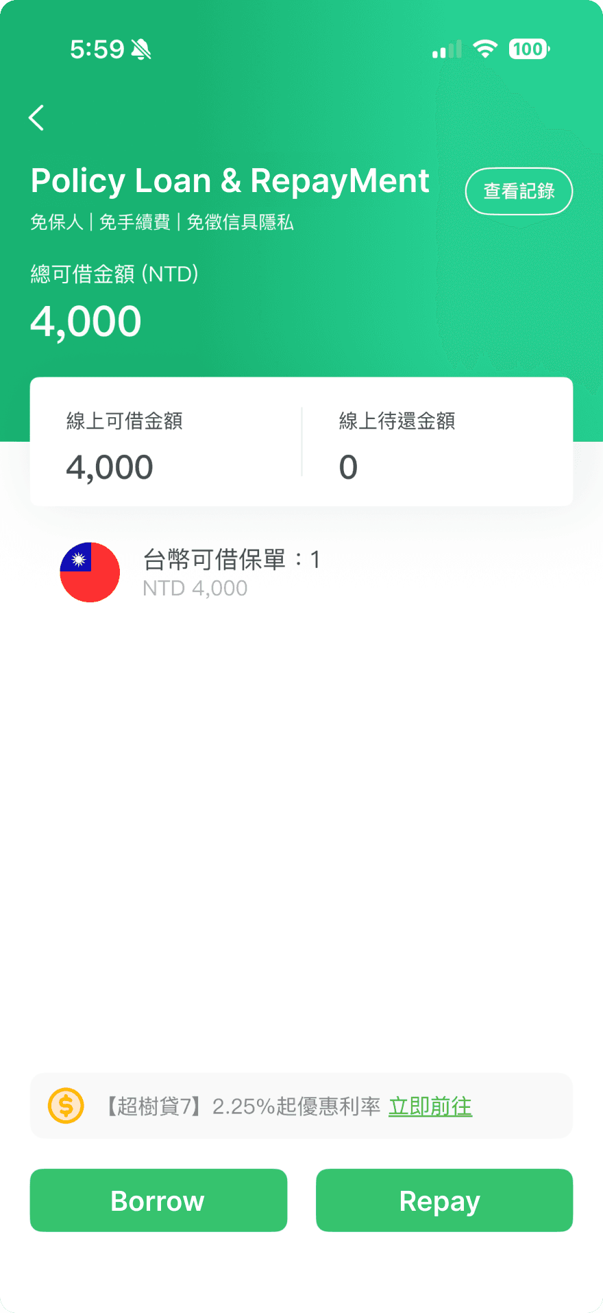
① Centralized Loan Overview to Reduce Cognitive and Decision Cost
We consolidated previously fragmented loan and repayment information into a single loan management page, surfacing available credit, outstanding balances, interest rates, and transaction history in one place. This allows users to quickly understand their overall loan status before deciding whether and how to take action.

② One-Step Loan and Repayment Flow to Minimize Friction
We redesigned the loan and repayment process from a multi-step, back-and-forth flow into a single, inline interaction with real-time calculations. By supporting cross-policy input and immediate feedback, users can complete borrowing or repayment in one pass without repetitive navigation or interruptions.

IMPACT
This project established a user-centered framework for evaluating the policyholder experience beyond feature completeness.
Rather than focusing on isolated usability issues, the research clarified how navigation, policy understanding, and service execution work together to shape users’ confidence—especially in infrequent but high-stakes interactions such as loan repayment. This perspective helped surface experience gaps that were not visible through functional audits alone.
As a Proof of Concept, the outcome was not a finalized product but a shared structure for decision-making. The findings and design responses provided Chubb with a clearer lens for prioritizing future improvements, aligning stakeholders around user intent, and supporting longer-term platform evolution toward more intuitive, status-driven experiences.

