
HomeXin
How can we improve the completion rate of the caregiver request form?
OVERVIEW
Home心 is a LINE bot–based platform that matches caregivers with families in need of care services.
This project focused on improving the caregiver request form completion rate, a key factor affecting successful matches.
User research revealed that the form was difficult to complete due to unclear wording, high cognitive load, and rigid information requirements.
Based on these insights, we redesigned the form flow, simplified the assessment process using the ADL scale, and refined UI and UX writing to reduce user hesitation and anxiety.
Role
UX Designer
Duration
Feb. 2023 - June.2023
BACKGROUND
About HomeXin
HomeXin is a platform that connects caregivers with families (or individuals seeking caregivers for patients). It aims to provide a transparent and reliable environment, allowing families to feel more secure while enabling caregivers to accept jobs more flexibly.
Product Overview
At the time of this project, Home心 primarily operated as a LINE bot.Below is the user flow for finding a caregiver before the redesign.

Problem
Form completion time was too long: the average completion time exceeded 5 minutes.
High form abandonment rate: out of 3,583 form entries, 2,461 users failed to complete the matching process
→ 68% drop-off rate!
PROJECT GOAL
The client initially proposed reducing the average form completion time to under 2 minutes. However, we reframed the goal after examining the business context. For HomeXin, increasing revenue depends on increasing successful matches.
The number of caregiver requests can be expressed as:
Requests = users entering the form × form completion rate
While we could not directly increase traffic, we could improve completion among users already in the flow. Rather than optimizing time alone, we redefined the project goal as:
Increasing the overall form completion rate.
DESIGN PROCESS
User Research
Define Problem
Build Hypothesis
Validate Design
RESEARCH
What prevented users from completing the form?
We conducted qualitative research to understand where and why users dropped out.
Research Constraints
Research recruitment presented challenges:
Home心 was a startup with a limited user base
Existing users were difficult to reach
The target audience (primary caregivers aged 40–60) was not easily accessible through common student recruitment channels
Our Approach
To address these constraints, we:
Recruited elderly family members for first-time usability testing
Conducted in-person interviews at hospital public areas in Taipei
Asked participants to complete tasks using the think-aloud method
This approach resulted in over a dozen interviews, with five participants completing usability tests.

Part of the Interview Result
Key Findings
Unconfirmed Care Needs
The form lacked “I don’t know” options, leaving users unsure how to proceed when patient conditions were not yet confirmed.
Difficulty Identifying Medical Conditions
Users struggled to find appropriate condition categories, and the “Other” option provided no clear way to add details.
High Cognitive Load
Users had difficulty recalling detailed patient information, leading to repeated verification and increased mental effort.
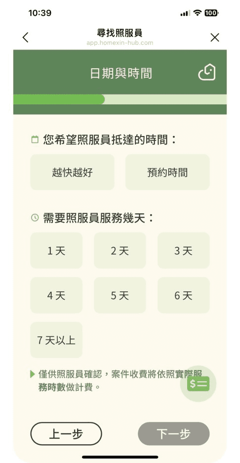
Confusing Fee Indicator
A floating icon explaining platform fees was unclear and caused hesitation.
DEFINE PROBLEM
The request form was too difficult to complete
All participants experienced confusion or hesitation during form completion, indicating significant usability issues
Ambiguous UI and form wording
Unclear interface elements and vague wording forced users to stop and interpret what was being asked.
BUILD HYPOTHESIS
Fogg Behavior Model
According to the Fogg Behavior Model, behavior occurs when motivation, ability, and trigger are present.
In this case, motivation existed, but ability was low due to form complexity.
Our hypothesis was:
“Reducing form difficulty would increase users’ ability to act, leading to higher completion rates.”

DESIGN RESEARCH
To reduce form difficulty, we conducted expert interviews and competitive analysis.
Expert Interviews
We interviewed one nurse and contacted five caregiver agencies from a family member’s perspective.
Key takeaways:
Required information: location, gender, age, medical condition, weight
Non-essential information: tubes, schedules, eating ability, bedridden status
Non-essential details could be confirmed after matching.
The nurse introduced the ADL scale, commonly used in hospitals to assess daily living ability.
Families found it easier to describe capabilities rather than abstract care needs.
Eating
Bathing
Moving

Competitive Analysis
We analyzed:
Direct competitors (e.g., 家天使, 優照護)
Cross-industry form-based flows (transportation, e-commerce, banking)
The goal was to identify patterns that reduce decision load and guide users through complex forms.
User Flow
Minimize steps whenever possible
Help users feel they are “placing a request/order” first; payment and secondary settings can happen later
Reduce decision-making load so users can stay focused on the current task
User Interface
Use numbered stages to show how many steps remain
Make progress visible on every page
Keep CTA labels concise and highlight the key benefit
Use collapsible sections to reduce long explanations
Reflect state changes clearly after input (e.g., button state and feedback)
UX Writing
Encourage users to complete the task
Make CTAs clear while reinforcing the value of the service (what the user gains by choosing it)
Clearly explain input requirements and conditions
DESIGN RESPONSE
1) Redesigning the Care Questionnaire with the ADL Scale
The original request questionnaire was difficult for users to complete (e.g., uncertainty about care needs and difficulty recalling details). We redesigned the questionnaire using the ADL (Activities of Daily Living) scale, consolidating overlapping items and focusing on fewer, easier-to-answer questions.
We first assess mobility by asking whether the patient is long-term bedridden; if yes, we default bathing and mobility as not independently manageable
If not bedridden, we ask about meals, bathing, toileting, and mobility in a progressive order
Starting from the second question, we added “I don’t know” options to allow users to submit a request even when details are not fully confirmed
After matching, caregivers can confirm missing information via follow-up calls
2) Increasing Flexibility to Reduce Form-Filling Pressure
Research showed the form required complete and precise information, which became a major barrier for families who needed urgent care. After aligning on “must-have” information with the client, we increased input flexibility in three ways:
Removed the height field
Height was not essential for matching and removing it reduced effort.
Added “I don’t know / Not sure” options
Users could proceed even without confirmed details.
Reduced pressure through wording
We used “about/approximately” for weight and age fields to signal that estimates were acceptable.
Changed the medical condition field to manual input
We enabled users to describe conditions in their own words while still receiving guidance.
3) User Flow Updates

Based on usability findings and competitive patterns, we restructured the end-to-end flow and created an updated user flow map to guide wireframing.
Showing pricing early
Establish a clear sense of purpose (similar to placing an order first)
Replacing the original request questionnaire with the ADL-based questionnaire
Starting with easier, more recall-friendly questions to help users build momentum
4) UI Redesign
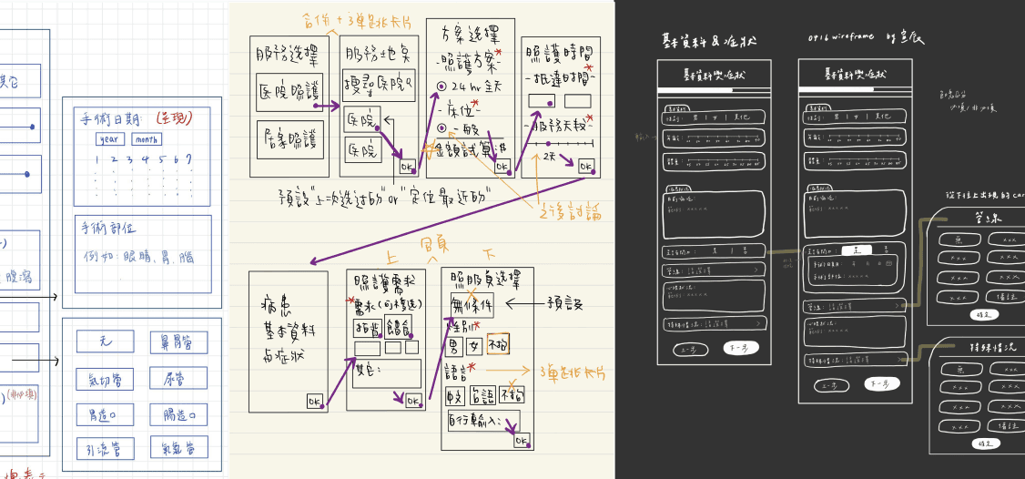
After multiple wireframe iterations, we finalized three major UI changes:
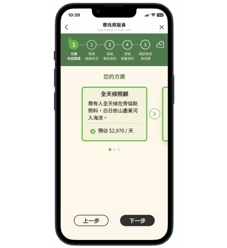
Redesigned the progress indicator
Numbered steps clearly communicated how many steps remained and encouraged completion.

Redesigned the plan selection page
Previously, only one plan option existed, which confused users and created dead-ends (CTA disabled unless a selection was made).
We listed upcoming plans to make the page more logical and to communicate future product direction.
Removed the floating fee button
This element caused confusion and introduced unnecessary hesitation.

TESTING
Testing Method
To validate whether the redesigned flow and questionnaire effectively reduced form-filling difficulty, we conducted task-based usability testing with representative users.
Participants: First-time users who matched the target profile (primary caregivers or family members)
Method: Moderated usability testing using realistic care-request scenarios
Evaluation metric: SEQ (Single Ease Question) to capture perceived task difficulty after each key step
Task 1: Starting the Request Flow and Selecting a Plan
Scenario
You are looking for a caregiver for your 78-year-old grandfather. Starting from May 27 at 10 a.m., he will need 24-hour continuous care for two days.
Task Goal
Start from the homepage and complete plan selection and cost calculation.
Observation Focus
Whether users hesitate when selecting service duration
Whether the plan options cause confusion or delay
Participant A
SEQ: Neutral
Feedback: The button to start the task was not obvious and felt slightly ambiguous.
Participant B
SEQ: Very easy
Feedback: The number of service days could be entered freely, but there was some discrepancy in how days were counted.
Both participants considered this task relatively easy, though they noted that certain buttons could be made clearer.
Task 2: Completing the ADL Questionnaire and Care Needs
Scenario
Your grandfather can eat and move independently, but his mobility is limited. He occasionally uses assistive devices but dislikes relying on them.
Daily activities such as brushing teeth and bathing are safer with assistance due to longer standing time.
He prefers having assistance when using the bathroom, though he is generally stable and does not experience incontinence.
Task Goal
Complete the ADL questionnaire based on the provided information.
Observation Focus
Time required to complete the questionnaire
Whether participants felt confused by the question content
Participant A
SEQ: Very easy
Feedback: The questions were straightforward and did not require much thought, but the options felt too dense and the hospital-related buttons were unclear.
Participant B
SEQ: Difficult
Feedback: Some questions were hard to answer logically—for example, whether being able to eat independently should still require meal preparation, or how to classify cases where the patient is usually bedridden but still able to move independently.
Participants showed significant divergence in this task. Participant A found the questionnaire intuitive and easy, while Participant B felt that edge cases and mixed conditions made the questions difficult to answer.
Task 3: Filling in Basic Information and Submitting the Request
Scenario
Your grandfather weighs 86 kg and is currently staying in a general ward at Tucheng Hospital.
He has a history of stroke and diabetes, and uses medical tubes such as a nasogastric tube, urinary catheter, and drainage tube.
Caregiver gender is not a concern, but Mandarin communication is preferred.
Task Goal
Fill in the required basic information and submit the request to search for a caregiver.
Observation Focus
Whether users encountered information they were unsure how to fill in
Reactions to the credit card binding step
Participant A
SEQ: Very easy
Feedback: The information was sufficient to complete the form, but the credit card binding step raised concerns. The participant did not feel comfortable binding card information within the system.
Participant B
SEQ: Easy
Feedback: Questioned whether the system allowed binding later instead. Entering card information at this stage felt risky.
Both participants rated this task as easy overall, but expressed strong concerns about payment and credit card binding, indicating a trust barrier at this stage.
Iteration
Based on feedback from usability testing, we conducted a first round of iteration focusing on elements that could be quickly improved.
Making the CTA More Visible
We enlarged the CTA button and changed it to a more prominent bright red color to increase visibility and make the primary action easier to identify.

→

Enlarging Selection Areas for Better Tappability
We increased the tappable area of selectable options so users could make selections more easily, reducing the risk of mis-taps and interaction errors.

→

Clarifying the “Select” Action
We made the “Select” action more explicit by visually distinguishing the selected state, helping users better understand which option had already been chosen.

→

Future Improvement Direction
Feedback from Participant B suggested that the redesigned medical condition questionnaire did not consistently make form completion easier.
To address this, we plan to conduct further usability testing and gather additional qualitative insights to inform the next iteration.
REFLECTION
Communicating with Stakeholders Without Over-Adapting to Business Assumptions
Participant feedback highlighted that design solutions intended to “help” users do not always produce the expected outcomes.
This reinforced the importance of continuous validation and grounding design decisions in real user evidence rather than assumptions.

